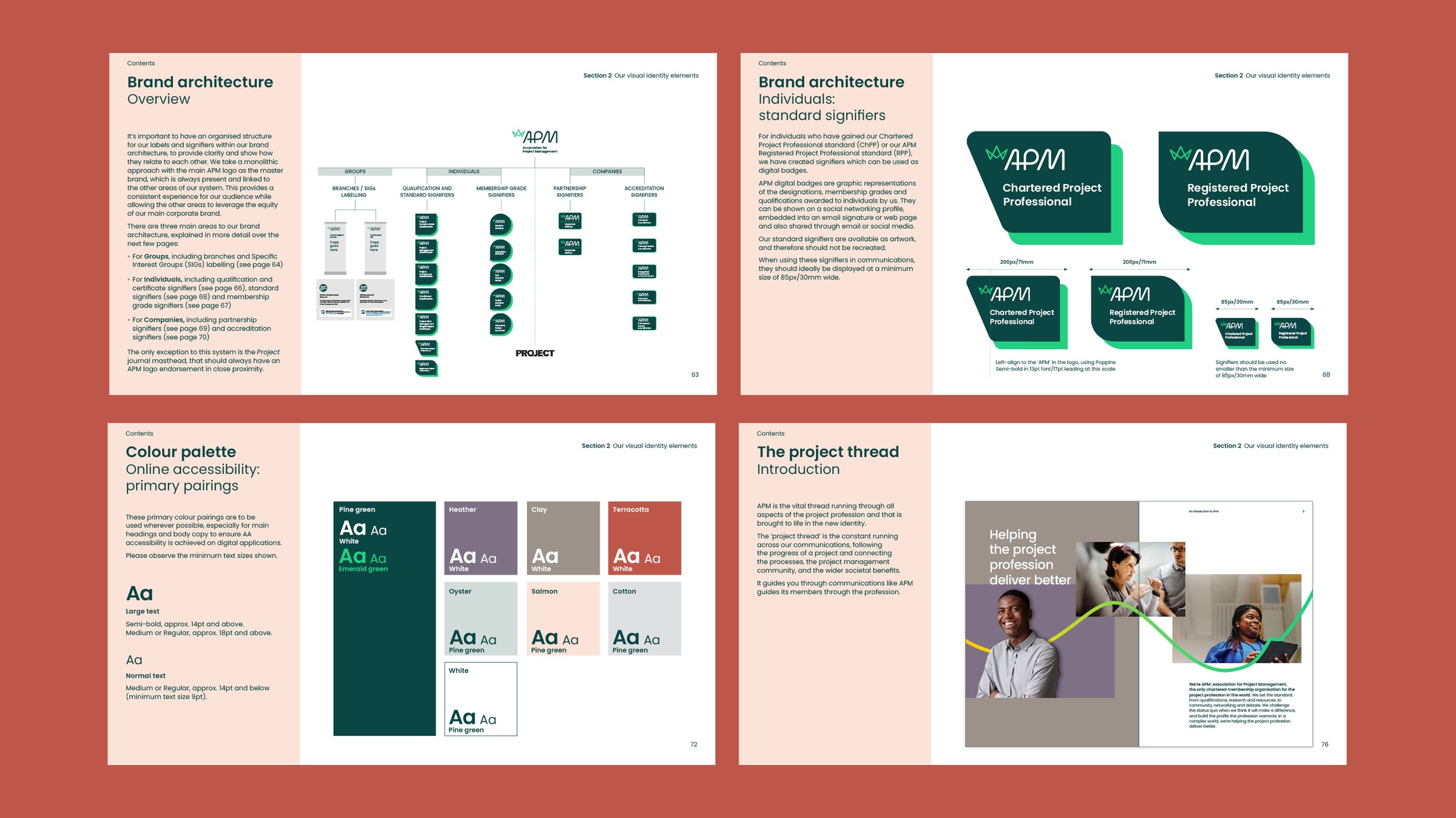
One key deliverable was the set of member and accreditation badges, used across APM communications as well as individual members’ LinkedIn and professional pages. I used curves and angles found within their new logo to create these shield-inspired shapes which could work with the variety of text lengths, forming an easy to understand hierarchy.


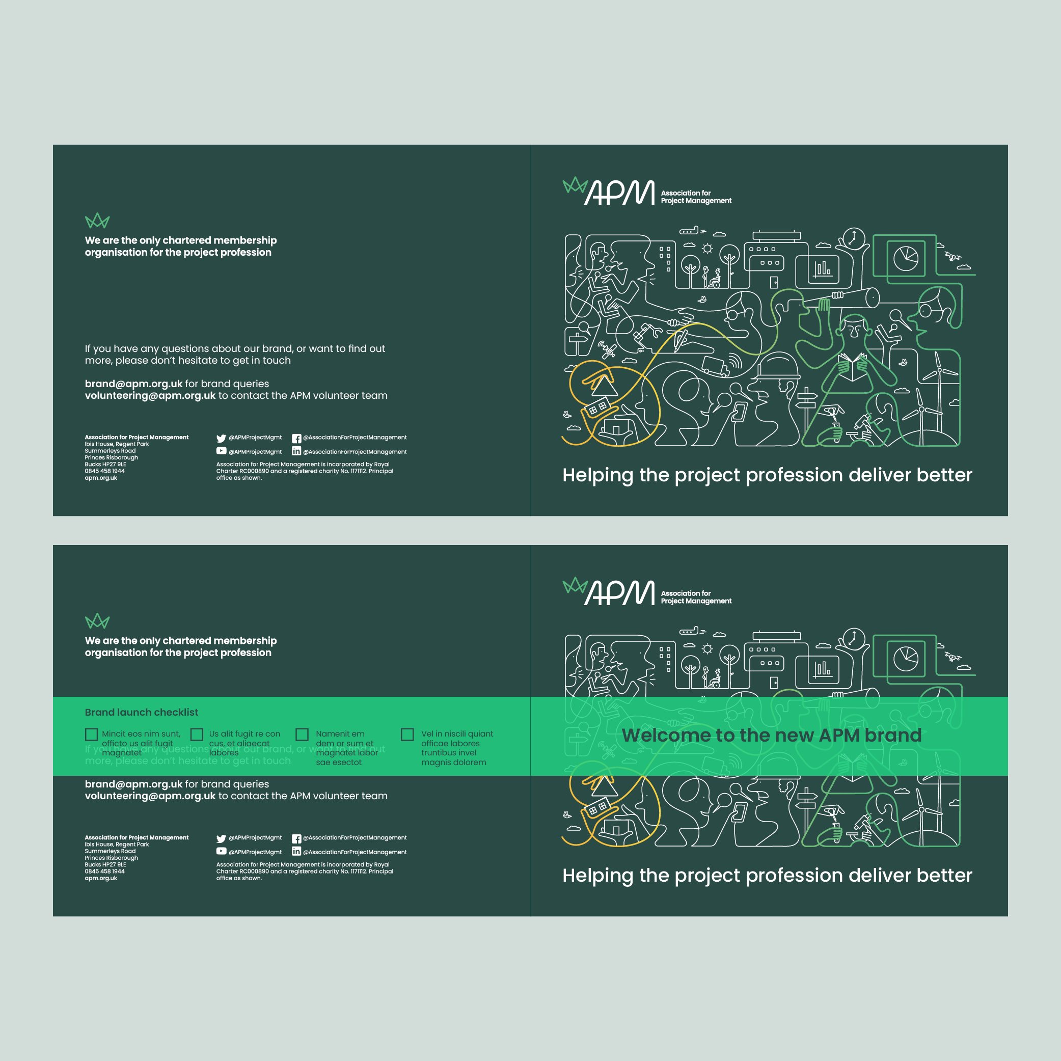
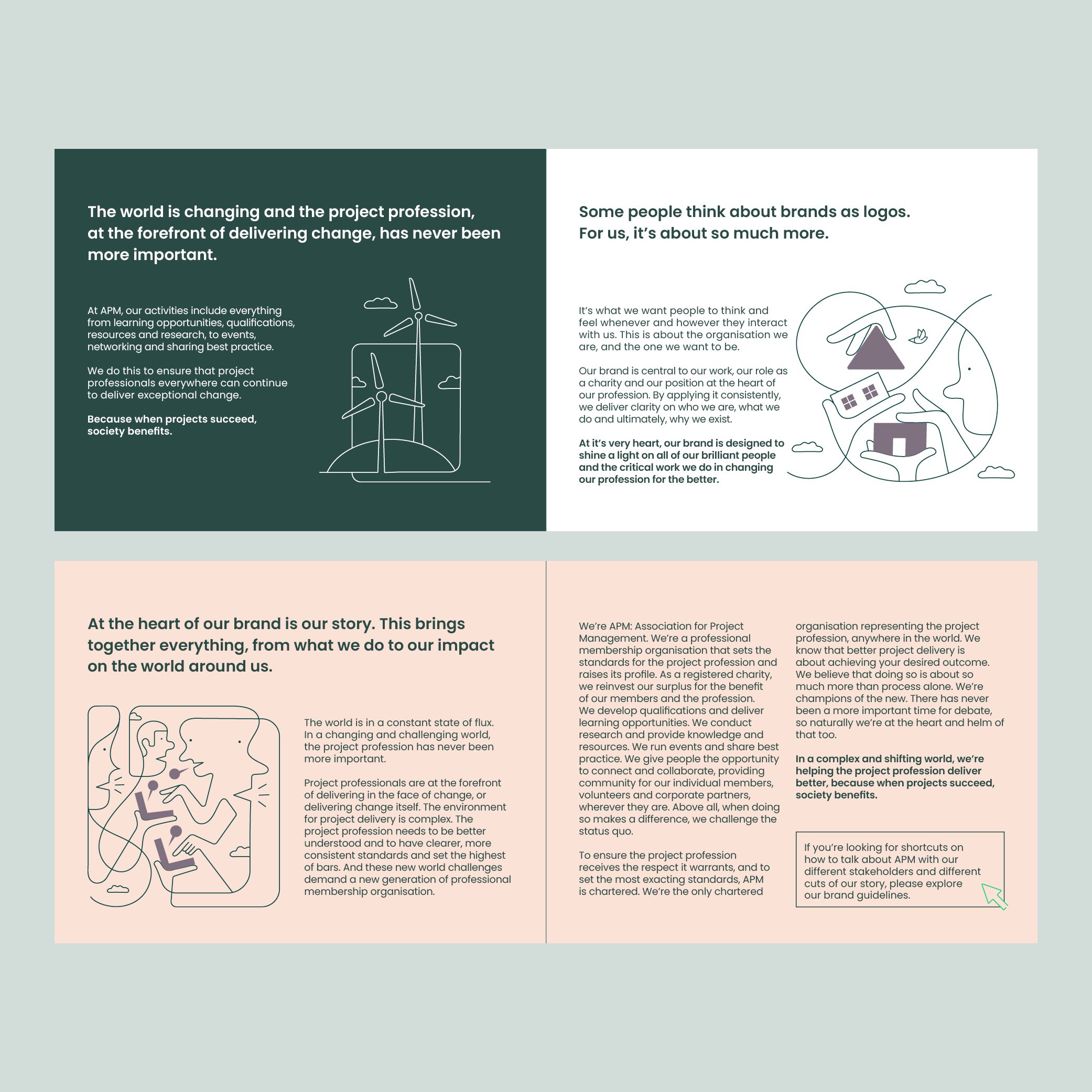
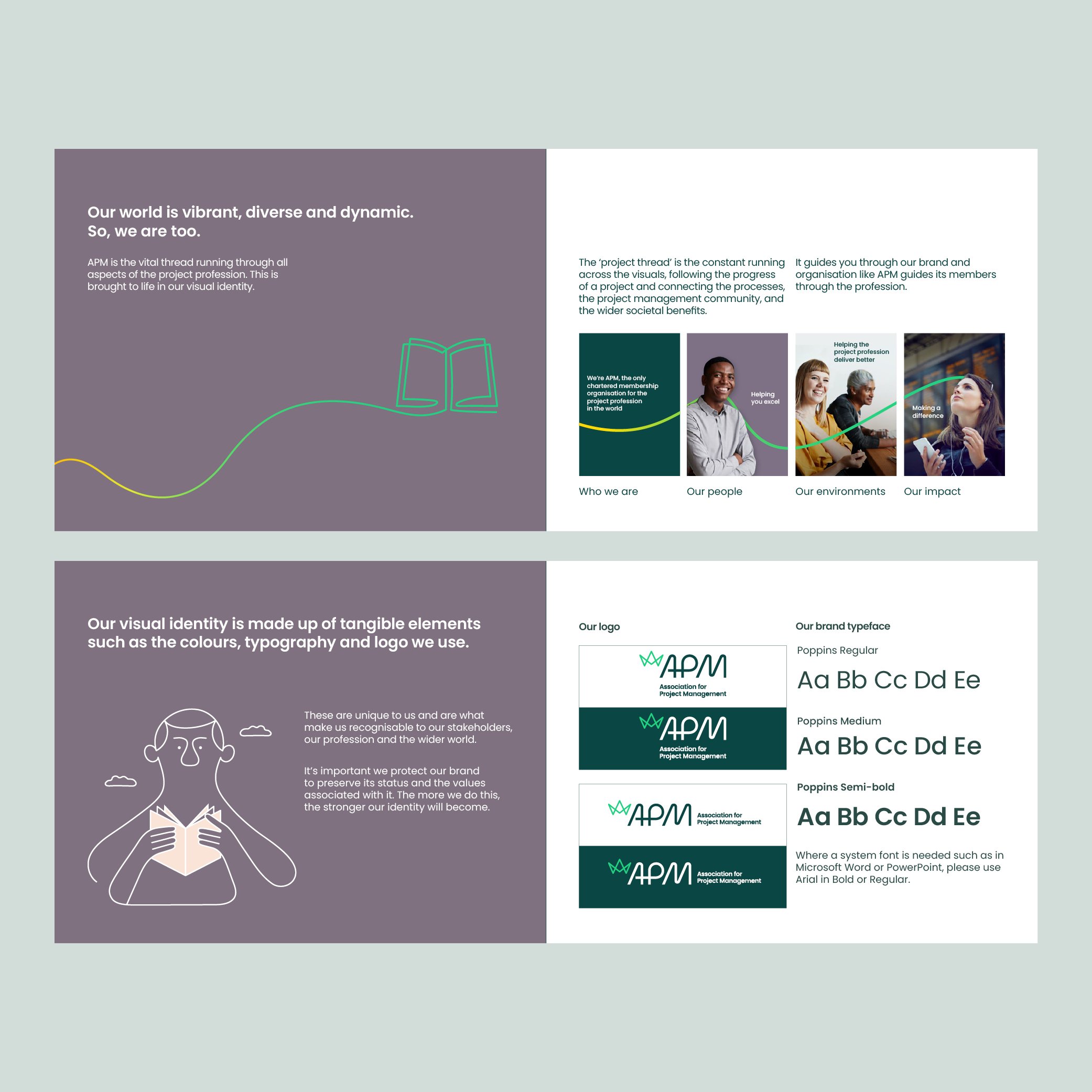
Brand illustrations by Jonathan Calugi

Brand illustration by Jonathan Calugi
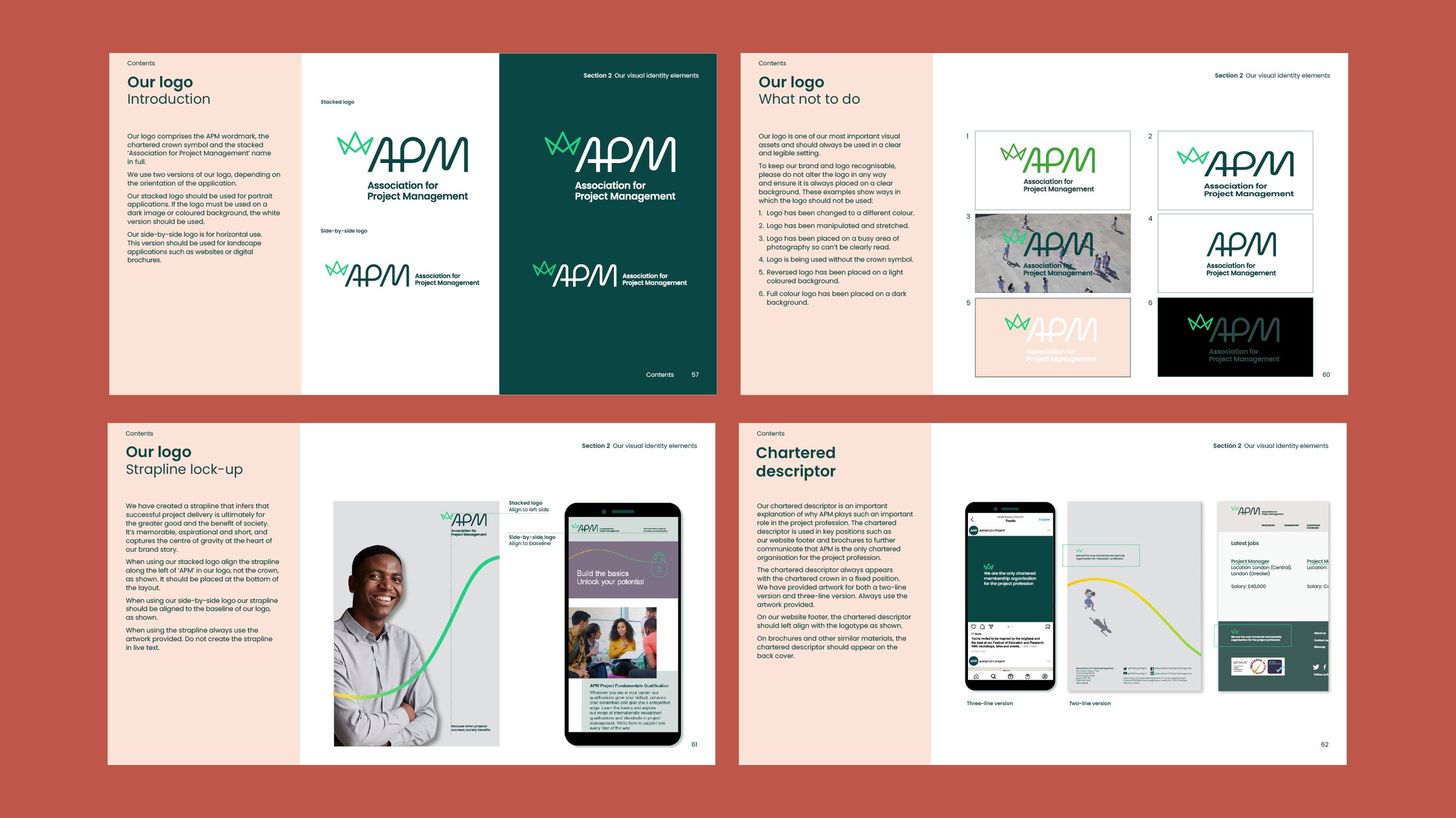
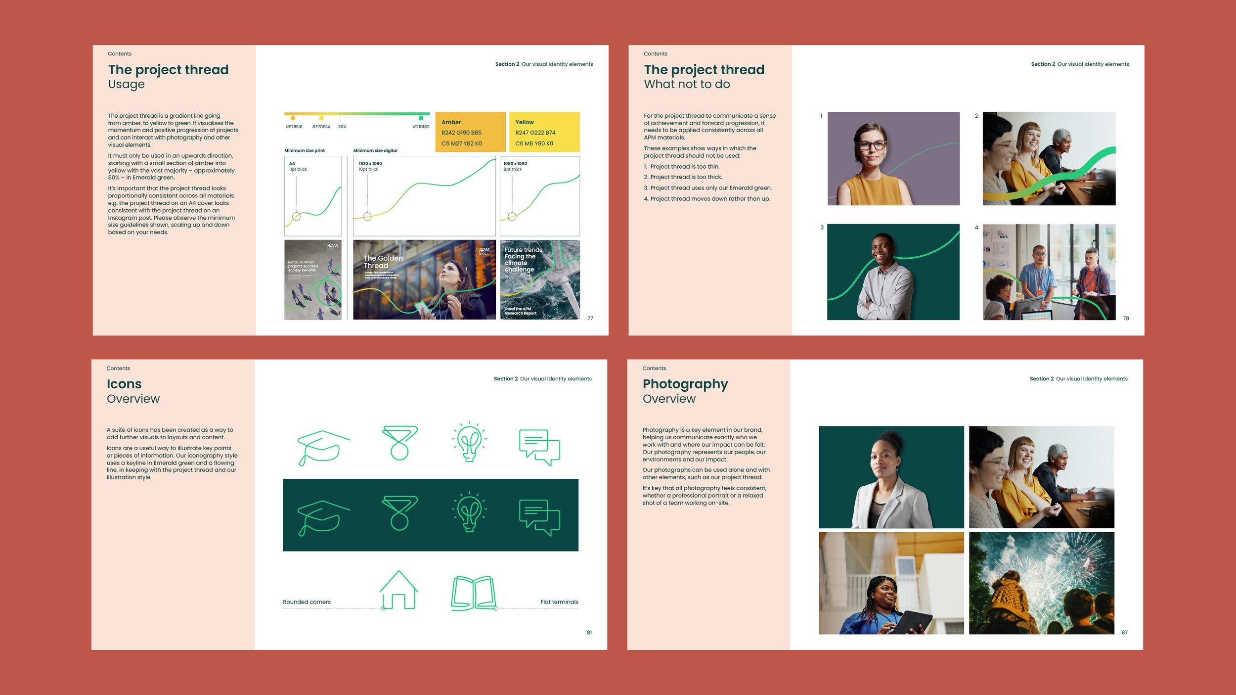
As part of the roll-out I created a brand book which was distributed across the organisation. This was a great opportunity to use the brand illustration in its full and smaller forms, showing the flexibility of the ‘thread’ graphic in print.