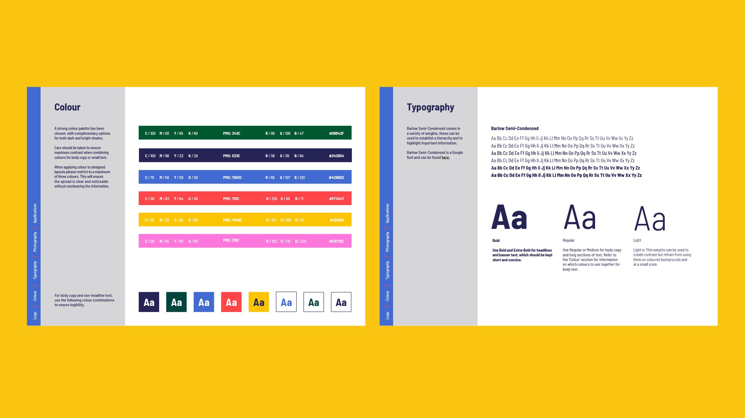
The YLC visual identity needed to be flexible enough to work for their teenage user base and the more corporate audience who viewed their annual reports and funding applications. The colour palette allowed us to flex their identity, with navy and dark green used across more serious assets.

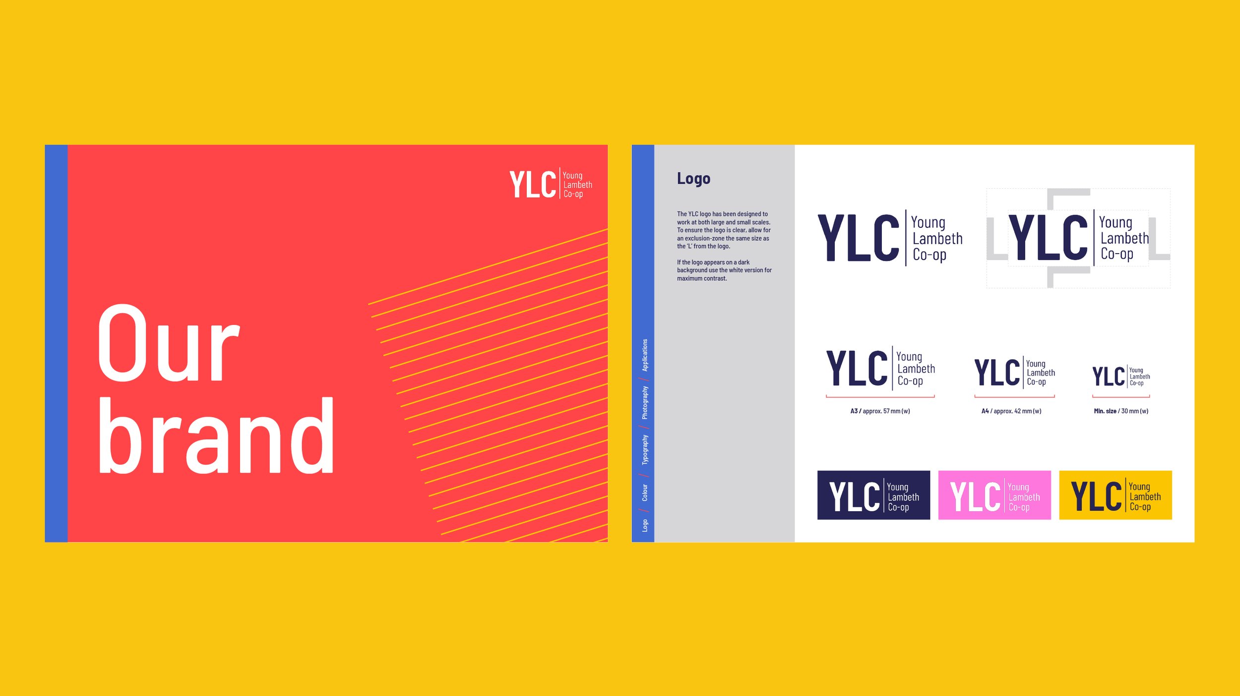
The ‘cog’ icons in their previous logo were no longer recognisable to their target audience or relevant to their work. Usually referred to as ‘YLC’, the new logo was designed to reflect this and be acronym-first.

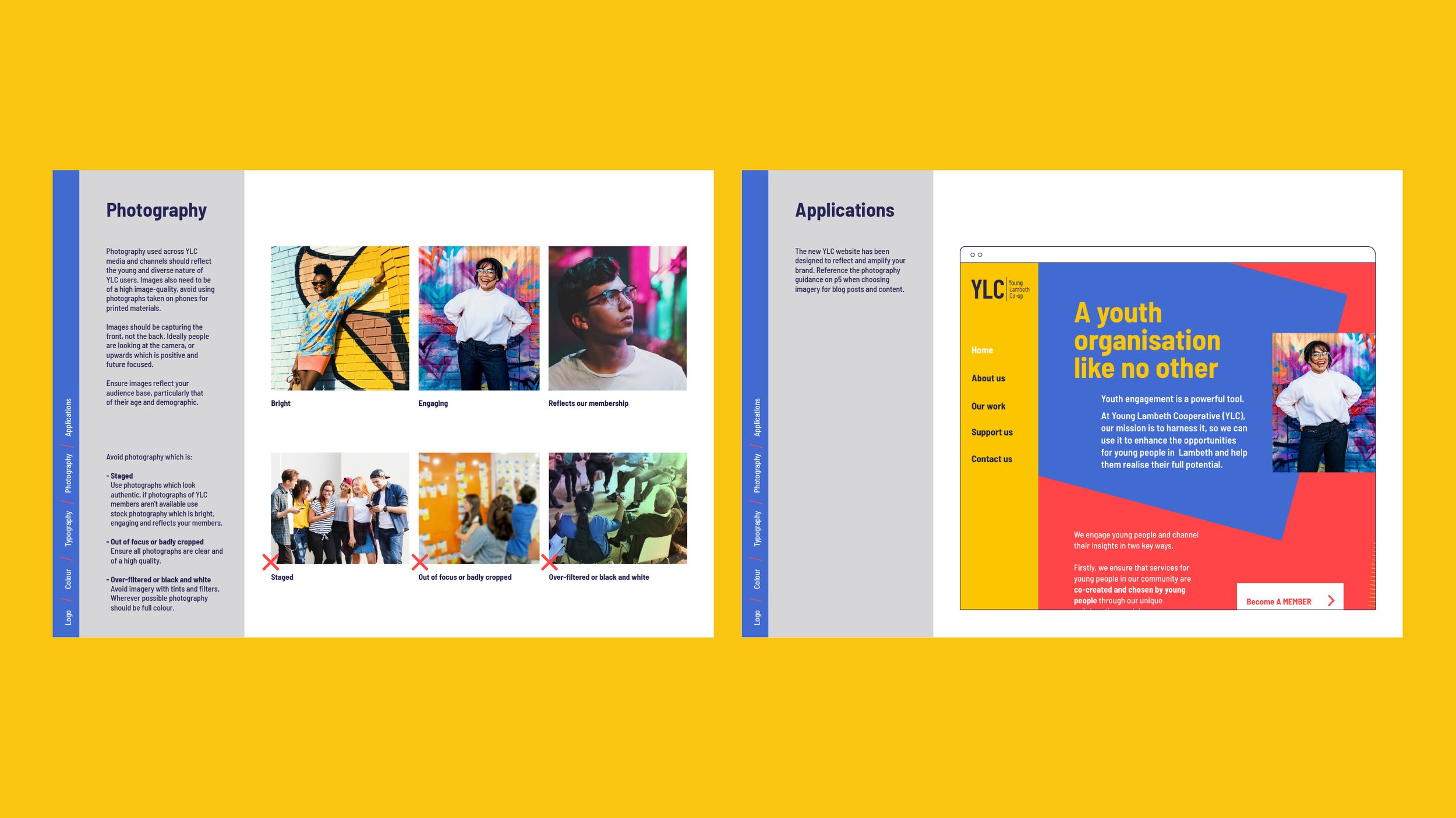
I developed a toolkit of shapes and hand drawn patterns which could be overlapped to hold information and imagery which was bright, engaging and immediately recognisable as a YLC material.