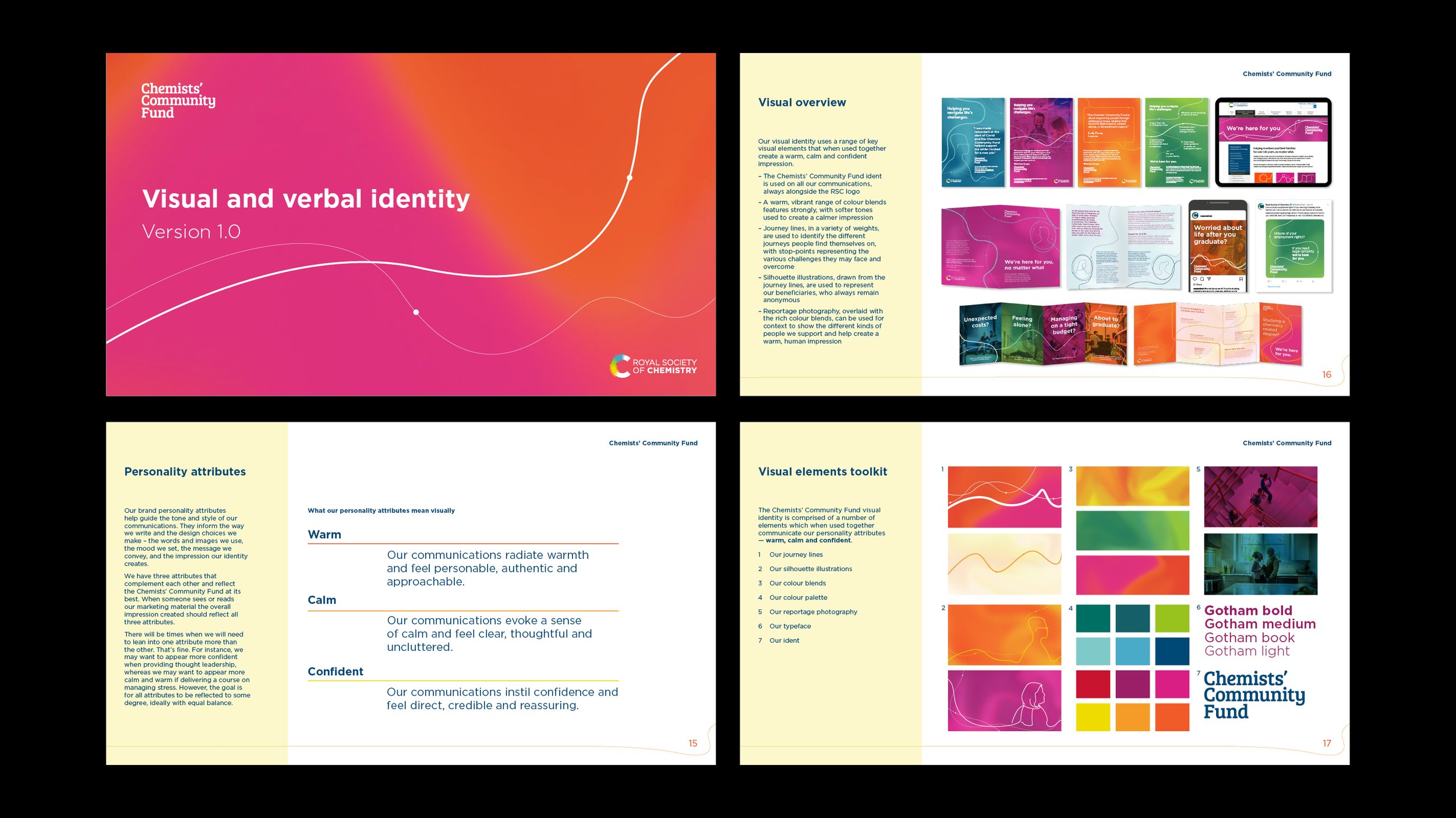


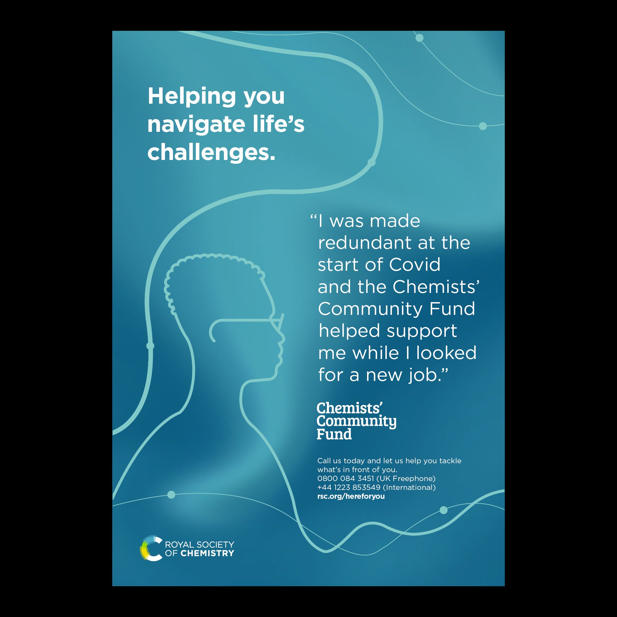
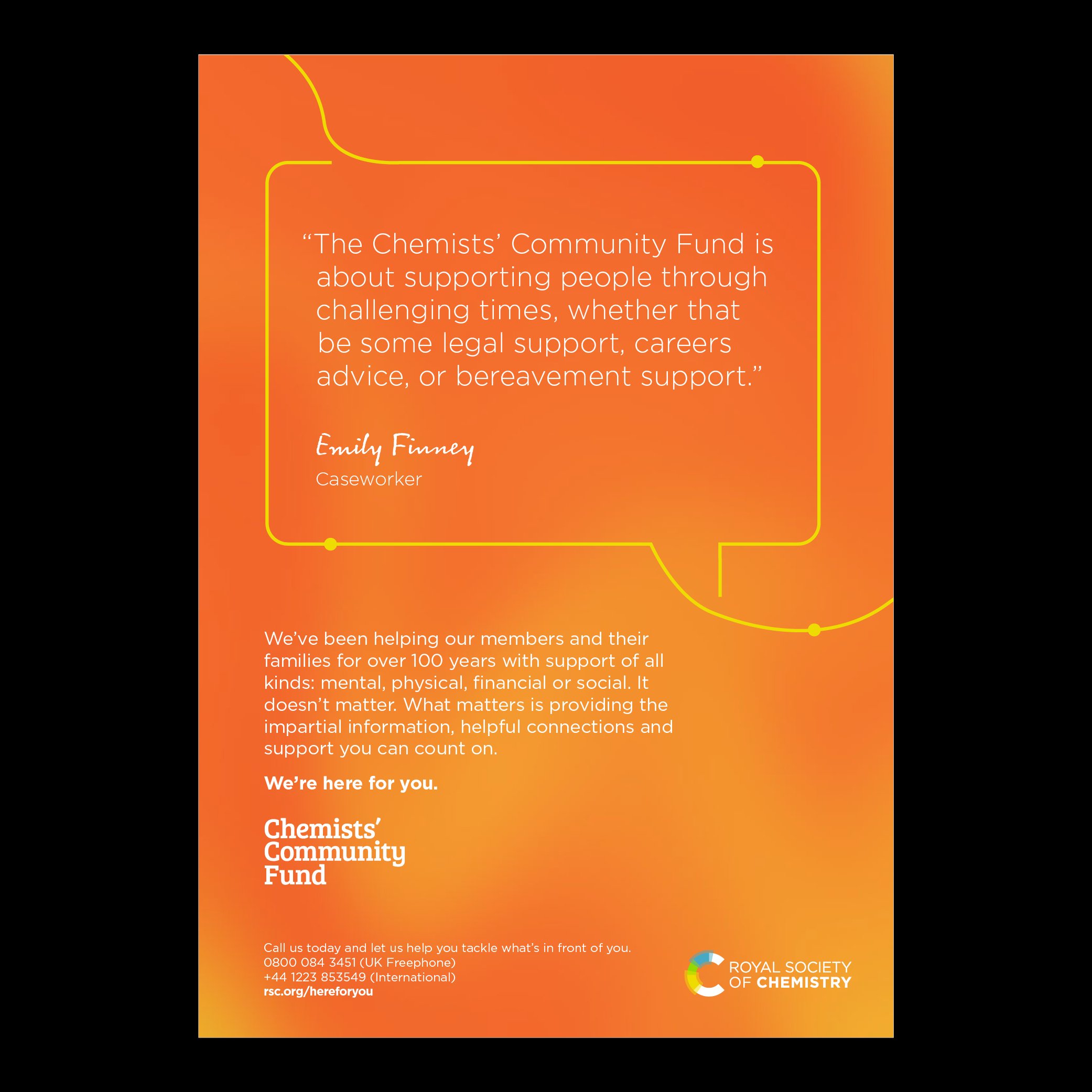
One key asset was the Chemists’ Community Fund logo. We wanted to retain a recognisable mark, but the client agreed that each of the three words were equally important, so a change of hierarchy was necessary. Now each of the three words is an equal size and weight to convey this.


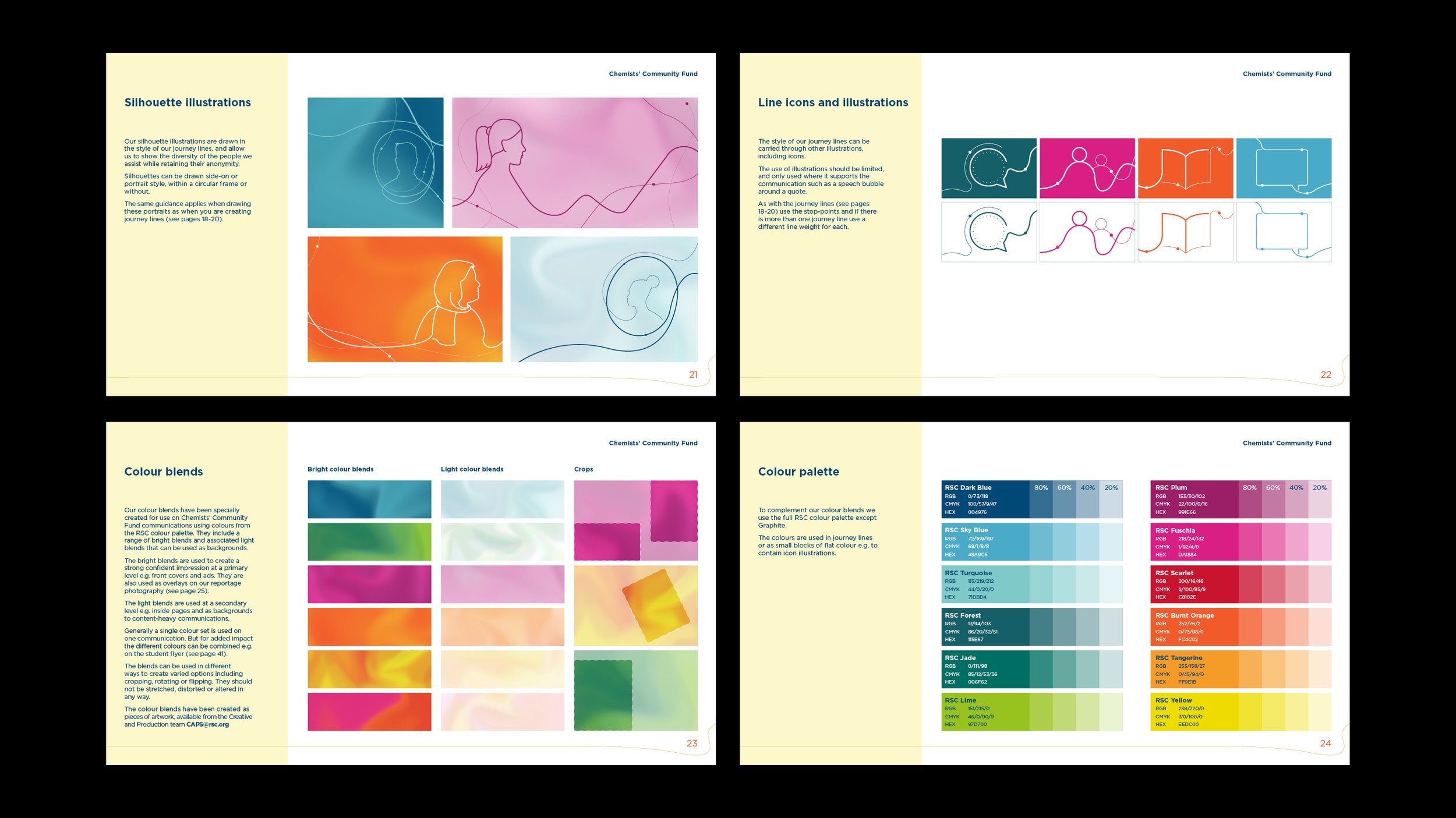
I created a suite of silhouette illustrations to ensure that we could show the human face of CCF users while protecting their anonymity when discussing issues such as mental health, redundancy, and support for people facing addiction issues.